By Charlotte Lowrie
Several people have asked me to explain how I create quadtone images. Duotone is an umbrella term that describes printing graphics, text, or images, using two inks. Specifically, a duotone image is a grayscale image printed with two inks, typically black and a second Pantone color. A tritone image is printed with three inks, and a quadtone is printed with four inks. The inks are usually Pantone colors that you can choose in Photoshop beginning with a dark base color such as black, a variation of black, or another dark color, along with a lighter second ink. A tritone adds a third ink, and fourth ink is added for a quadtone.
I learned this process while I was writing, editing, and designing a monthly magazine. Some signatures (sections) of the magazine were printed in four (full) color using CMYK inks, but we could not afford to print all of the magazine in four color. To dress up the non-four-color signatures, I would choose a Pantone ink and use it for selected headlines and graphics. When a Pantone color was designated for a signature, I could also use the Pantone color for printing black-and-white pictures, thus creating duotones. The approach saved money and created beautiful images in the magazine.
Today, I still use the duotone process because it softens monochrome images giving them a look that can’t be replicated with other techniques. For digital photographers, using duotone, tritone, and quadtone images can improve image printing because it assigns different Pantone colors to specific parts of the grayscale tonal range. This results in finer gradations of control when you print the image.
Here is how I processed the image of my friend, Milt. I shoot RAW images, so my first steps are to get a good conversion in Adobe Camera Raw. Then I take the image into Photoshop and set the curve, clean up imperfections, and do any other edits that the image requires.
I’m a big fan of Nik’s Silver Efex Pro 2 program because it provides a quick way to get to a monochrome rendering that closely replicates the renderings that can get with film and wet darkroom printing. While I prefer Silver Efex Pro 2, if you do not have it, you can use Photoshop’s Channel Mixer to convert a color image to grayscale, and then apply curves and filters to get the look you want. However, with Nik Silver Efex Pro 2, I have a selection of base renderings, and then I can modify them as much or as little as I want.
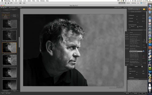
I open Nik Silver Efex Pro 2 from the Filters menu in Photoshop CS. In the left column, I can choose from a variety of renderings. For this image, I liked the contrasty look of the "Push Process (N+1.5)" option.
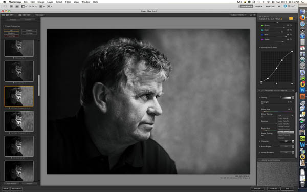
The folks at Nik software spent a lot of time shooting various black-and-white film. Then the Nik Software engineers replicated the look of the films, and I can then apply while I’m converting the image to monochrome, as I did with this image. As you move the mouse over each film option, the preview image changes to reflect the effect of the option.
The controls on the right side of the Nik Silver Efex Pro 2 are extensive. You can adjust every aspect of the image including the tonal curve, the brightness, contrast, and more. In addition, you can add a border and vignette. A separate article is needed to do justice to Nik's Silver Efex Pro 2's program.
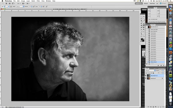
After I click OK in Silver Efex, the monochrome image is displayed as a layer above the Background layer in the Photoshop Layers Palette.
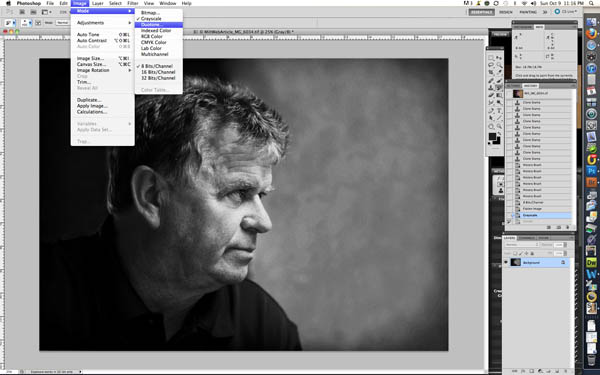
Before you can create a duotone, tritone, or quadtone, you must first:
- Flatten the image (Layer/Flatten Image)
- Convert the image to 8-Bits/channel (Image/Mode/8-Bits/Channel)
- Convert the image to Grayscale (Image Mode/Grayscale, and then click Yes when PS asks if you want to discard color information)
The next step is to choose Image/Mode/Duotone.
The Duotone Options dialog appears. The easiest route is to simply choose one of the preset color combinations.
Click the arrow to the right of Preset. A long list of preset duotone, tritone, and quadtone combinations appears. The naming is, at best cryptic, but the numbers to the right of the names tell you how many inks are used. You can go from mauve to orange to blue. I prefer the classic quadtones at the bottom of the list. The one I chose for this portrait is WarmGrayQuad.
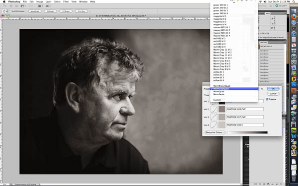
Now if you want to change the Pantone colors, you can double-click one of the colors to open the Pantone book. In this dialog box, you can choose the book you want to use, e.g., Pantone Solid Coated colors, Pastel colors, or choose from other color books. I stick with Pantone because I know the colors in their books best.
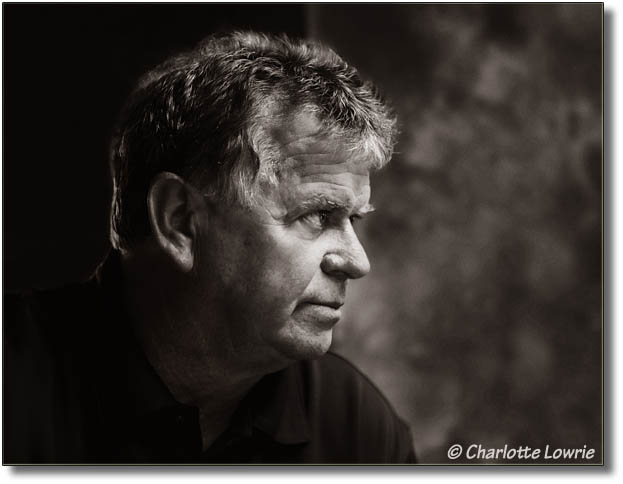
Another option is to double-click the tone curve thumbnail to the left of the color swatch. Then you can set the curve for the color just as you do in Photoshop while watching the effect on the image as you make changes. For this portrait, I left the curves at the defaults. Then click OK, and you have a quadtone rendering of the image. My final image is shown below.
 Since you have changed the image to 8-bit mode, you can no longer use certain filters, such as Nik Color Efex Pro 4. I decided to soften the wall pattern on the left of the portrait, and to do that in Color Efex, I just changed the image back to 16-bits and applied the Soft Focus effect to the right side of the wall.
That's the short story on creating duotone, tritone, and quadtone images. I think that you will like not only the visual renderings online, but you will also like the printed image as well.
Additional articles:
Also be sure to check out my book, the Canon EOS 60D Digital Field Guide.